HYDRATE & INSPIRE
Fierce Chapstick, Fierce Creative Agency
Designer
Project Type: Product Posters
Skill Focus: Creative Strategy, Photo Illustration, Design
Fierce has given me the opportunity to learn the nitty gritty of agency life. But, it also shows me the importance of company culture. A day to day for me can consist of pulling ad leads, making website edits, creating social content for our brands, but some days… I get the time to play and remember why I love being a creative.
Our design team loves to play around with new Fierce branded memorabilia like energy drinks, perfumes, and chapsticks. We also love to push our skills, which is why when I took on this project I wanted to try some new design techniques.
Here is my process on my project,
Hydrate & Inspire.
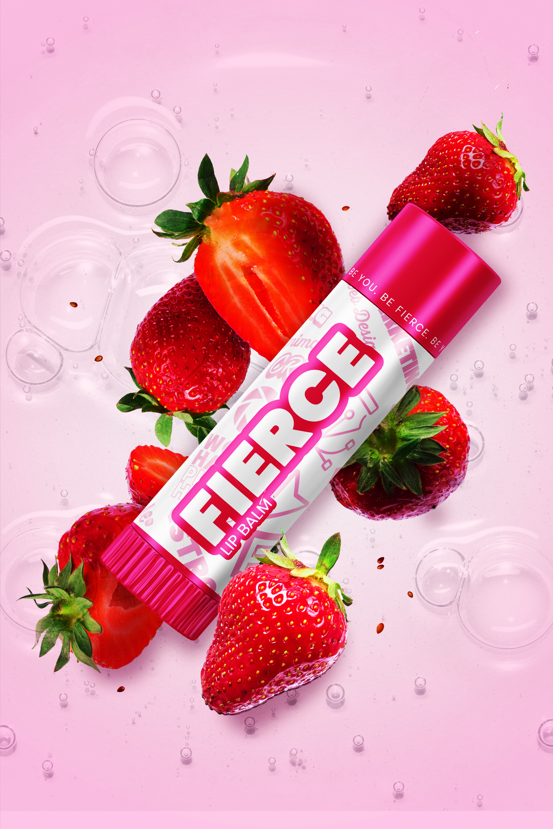
BEFORE & AFTER
Here, we can compare my work before and after feedback and several google tutorials. I presented my original concept to one of the other designers on the team. I could tell it had bones, but it was lacking depth and realism.
I was able to use Photoshop’s Harmonize feature to merge the lighting and effects of the chapstick mock with that of the strawberries. I discovered layer masks and how to add subtle shadows to show depth. This project showed me that a piece can always be pushed to be better. There are tools and fellow designers to help move a project from good to great.
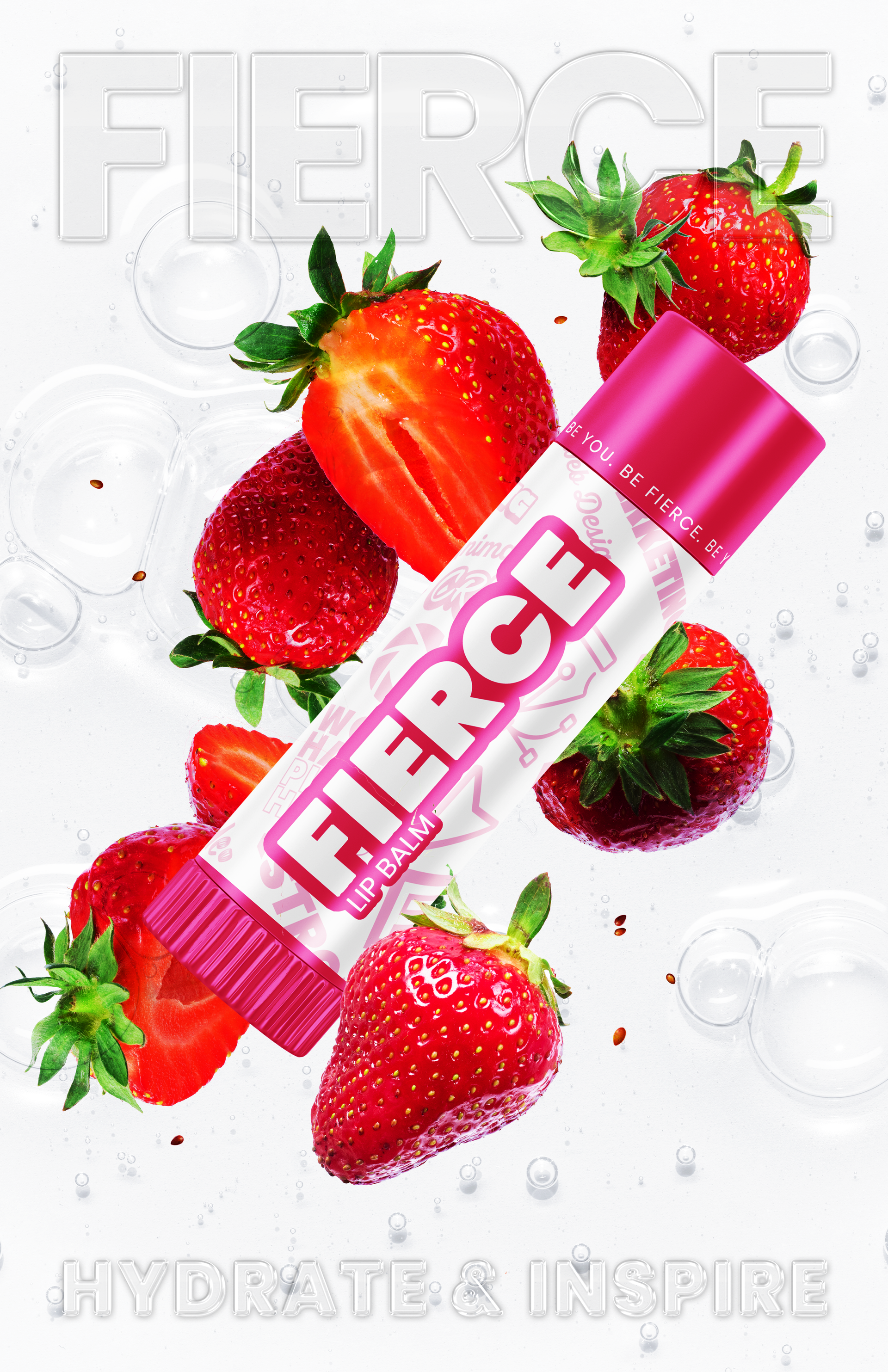
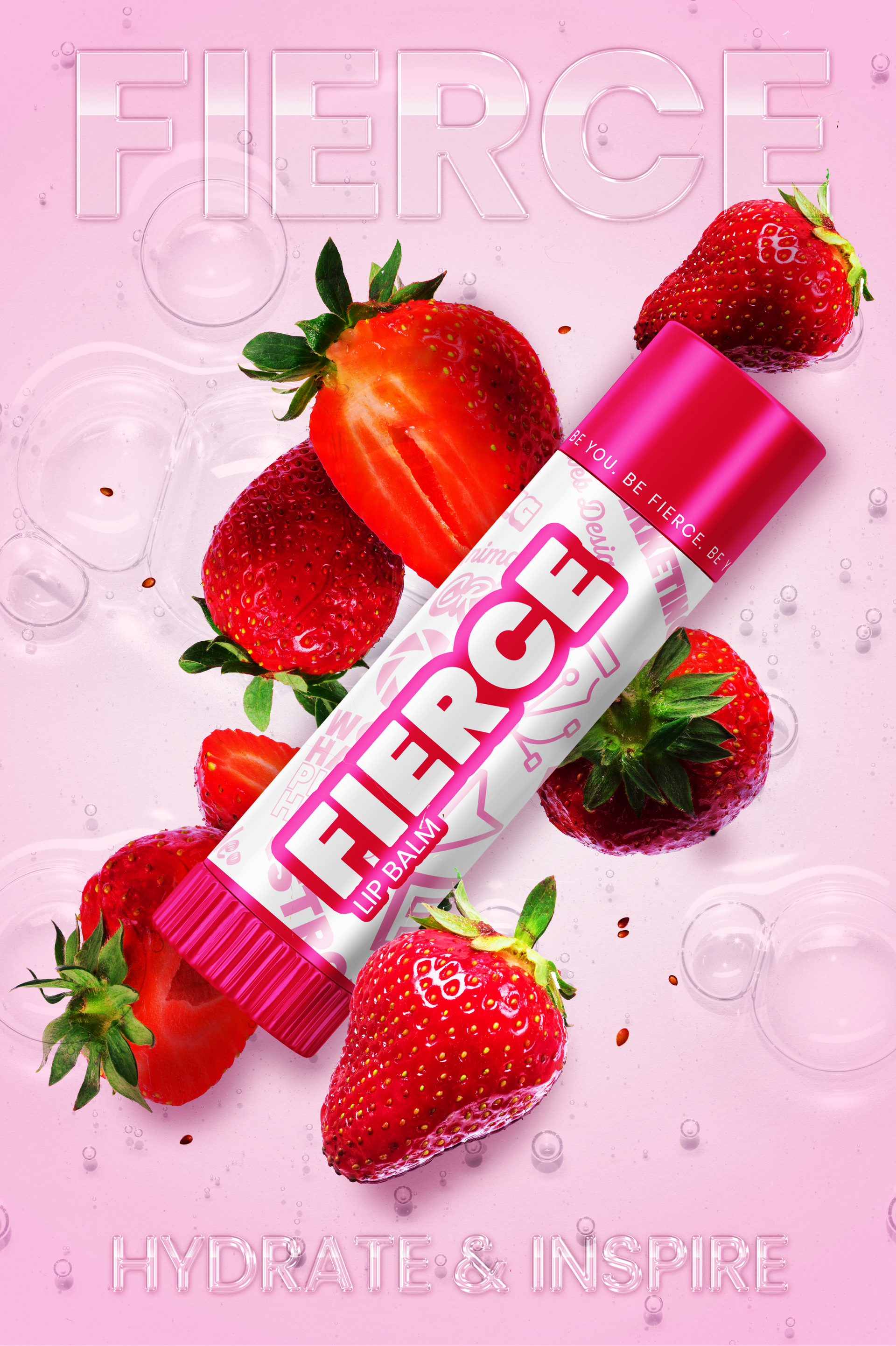
FINAL PRODUCTS
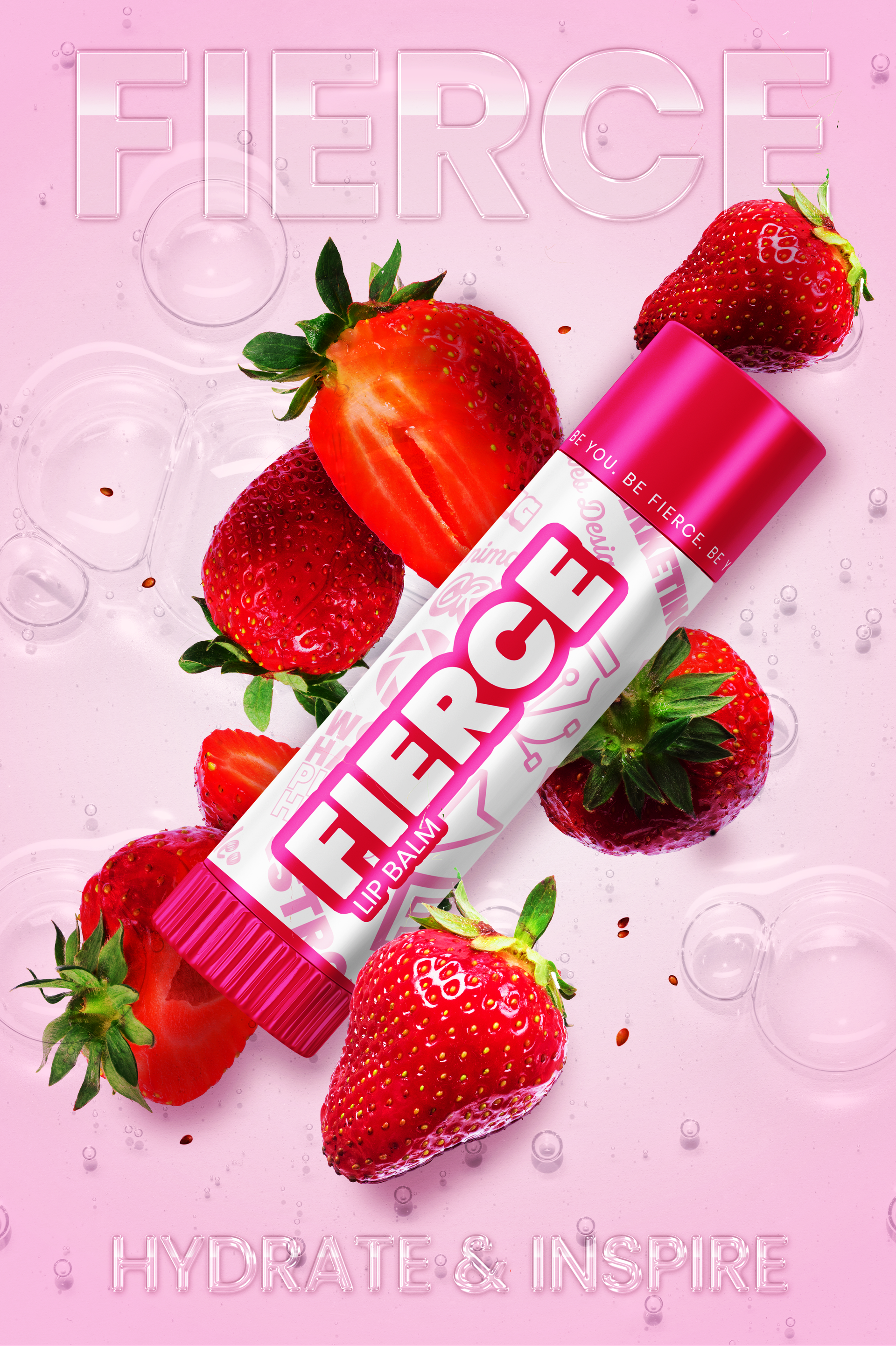
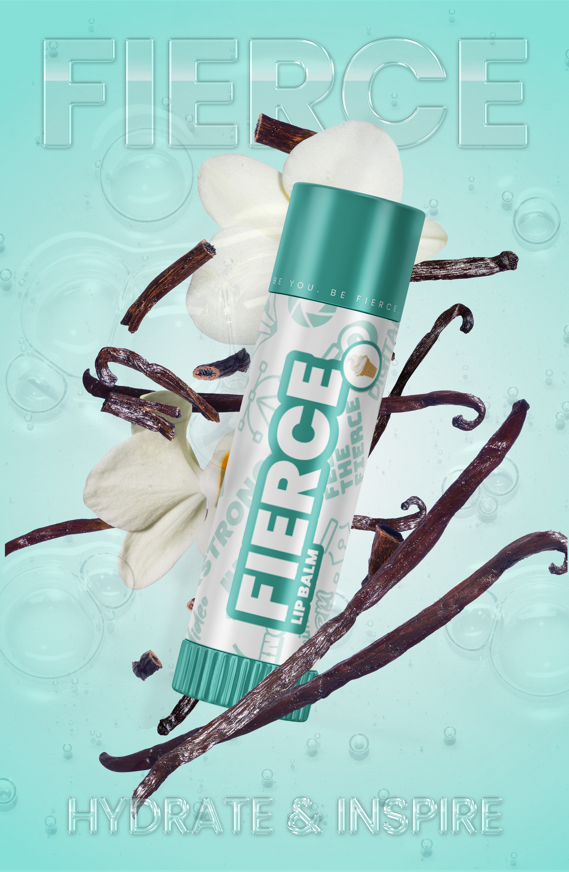
The final product posters are a reflection of hours of work and rounds of feedback with fellow designers. There is a layer of glossy bubbles on each poster, with vibrant, explosive images of the flavors they represent. The chapsticks are intertwined to make them feel united with the elements. The colors in the background make the glossy text readable, while it still feels like part of the glossy bubble background. I wanted to keep the overall feeling clean, while evoking specific scents. Using bright colors brings the eye directly to the product without being overbearing.
