MIZAIC

The Maneater, University of Missouri

Art Director

Project Type: Magazine

Skill Focus: Creative Strategy, Layout Design, Leadership, Creative Direction

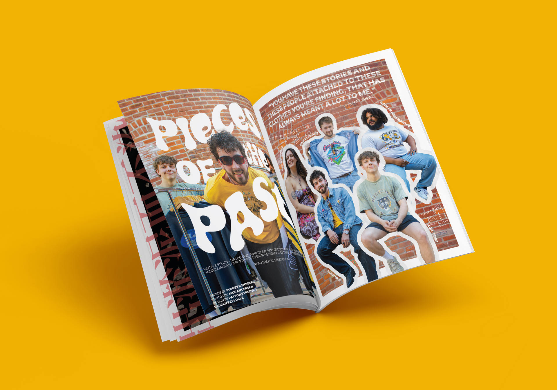
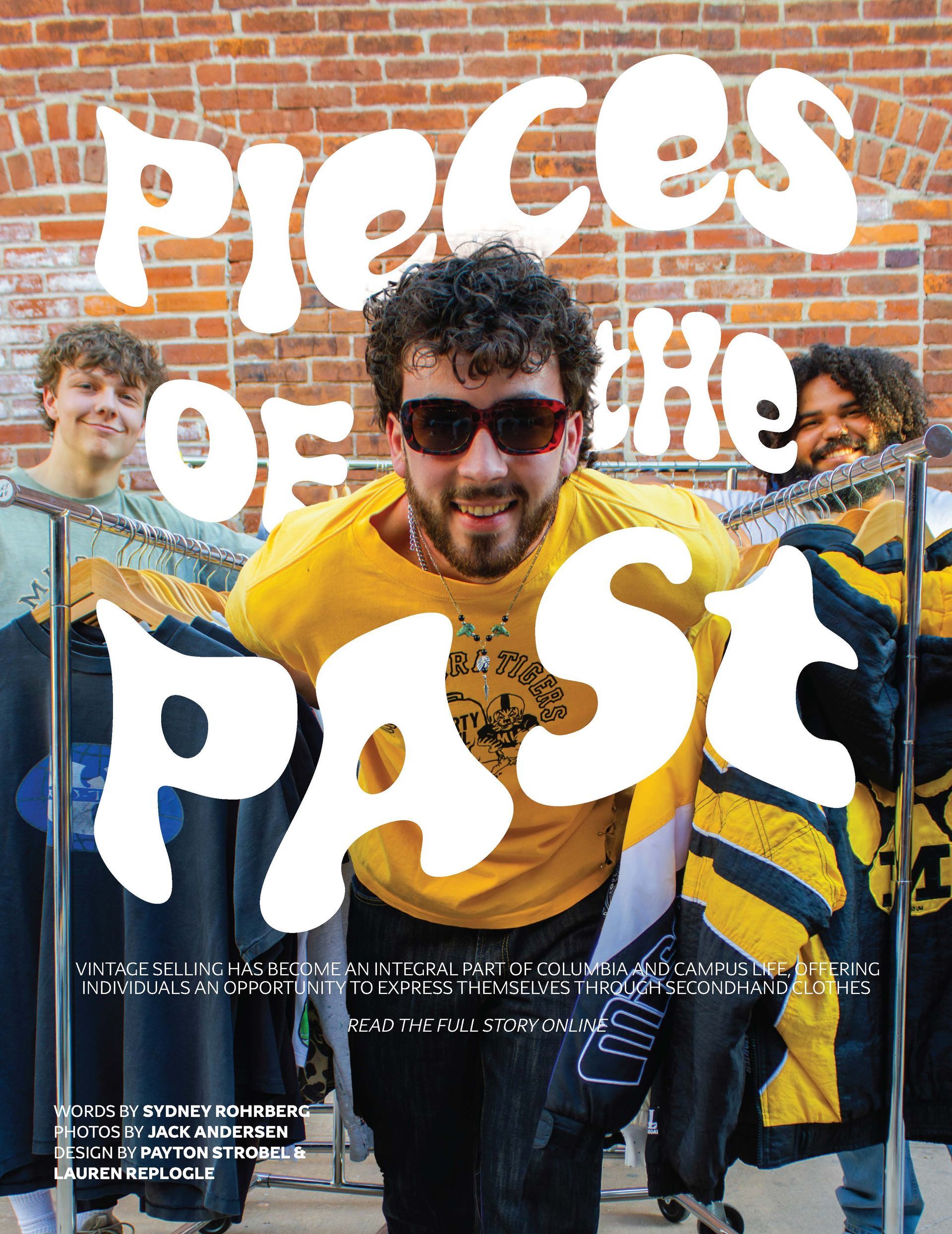
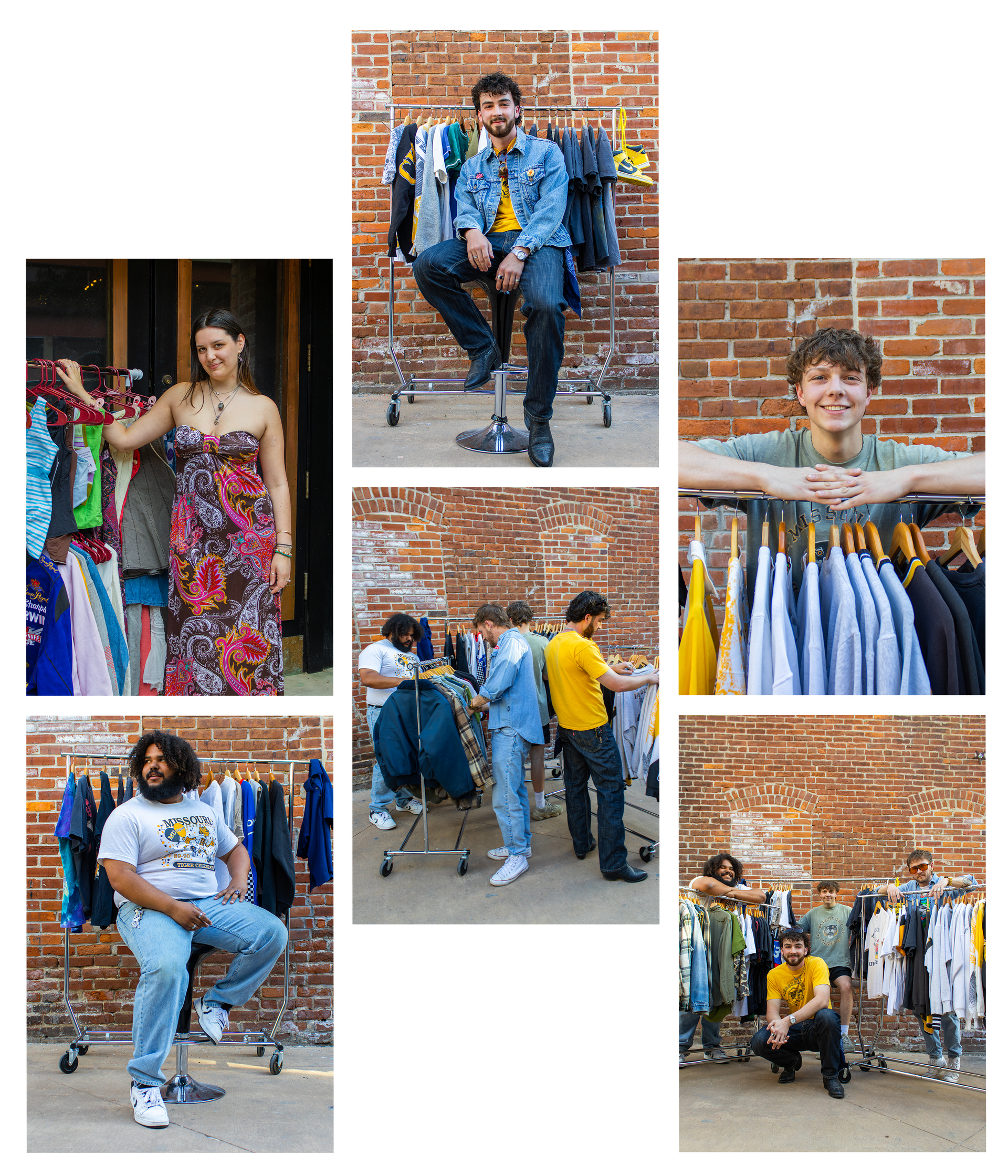
The University of MIssouri’s student newspaper, The Maneater, also houses an arts and culture magazine titled, Move Magazine. During my tenure, it was decided that we would bring the mag back to print, giving me the opportunity to lead as an art director. 


Our theme for this magazine was Mizaic. A play on how Mizzou students, their hobbies, their passions, and experiences, all contribute to the larger picture that makes up our school community. 


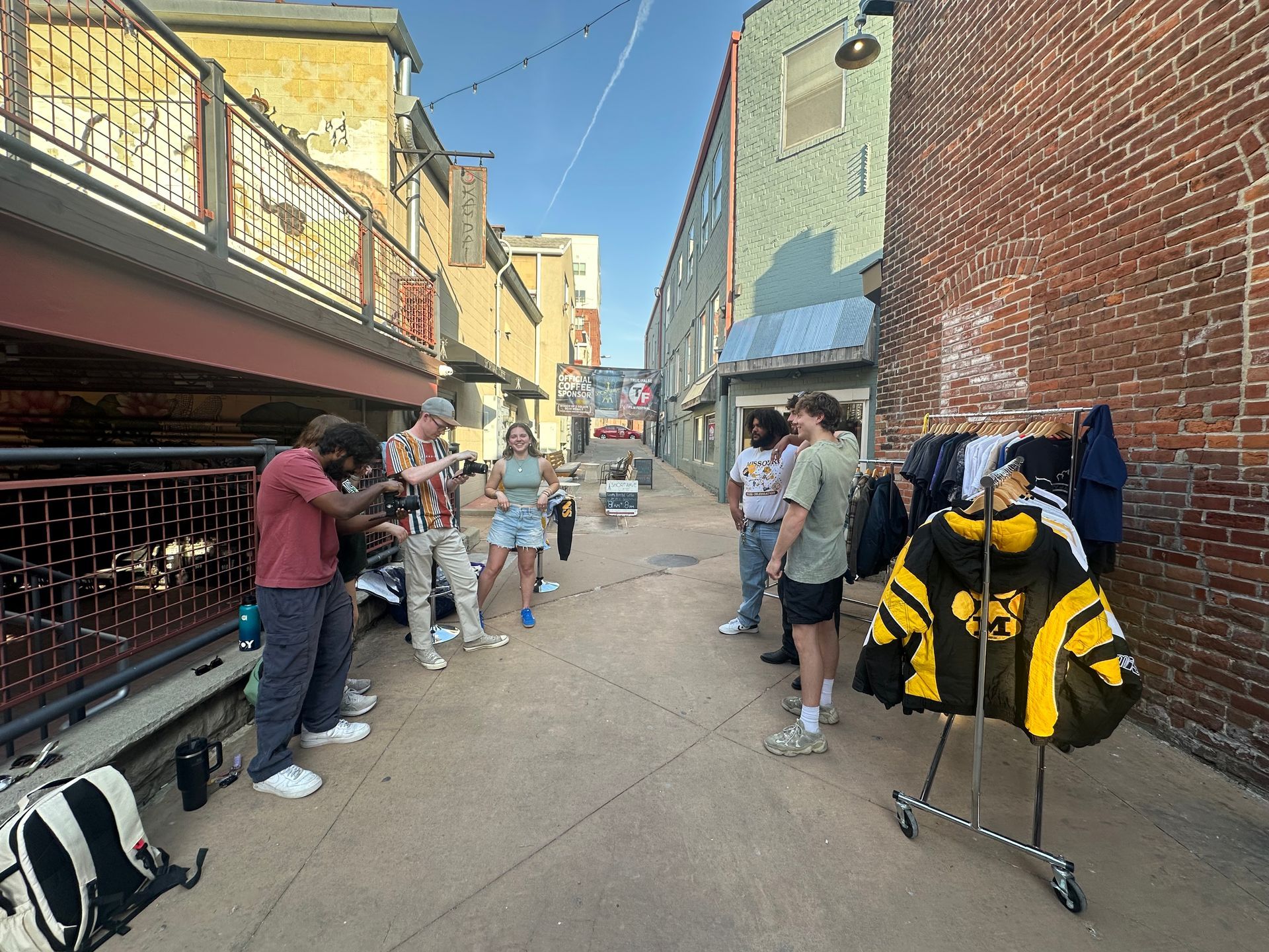
Our goal was to give the Mizzou community a magazine that they could see themselves represented in. We worked for seven months on photoshoots, articles, and layout design to produce this 16-page piece. 

INTERIOR SPREAD

This was the cover story for our magazine, so I knew it needed to have strong visuals and fit within the brand. These were images from our biggest photoshoot, we edited them in photoshop to emphasize how lots of people come together to fit into the mosaic that it Mizzou. I added a quote from one of the writer's interviews onto the brick behind the entrepreneurs to show her work as well. I wanted this piece to be extremely visual and jump out of the page, after many, many, MANY photoshop tweaks, we put this spread into our InDesign master doc and I am so happy with what we created.

PHOTO SESSIONS

I knew when we started this project that I wanted it to be very visually strong. To do this, we needed all of our photographers to understand our vision and produce high quality images. I worked with our photographer, Jack Andersen, on the assignments for different stories.


The most ambitious shoot we had was for our cover story, Pieces of the Past, focusing on the entrepreneurial second hand sellers on campus. We had five sellers come in with racks of clothes they thought represent their brand and Mizzou. The rustic brick of a downtown alleyway centers the shoot and gives it a vintage feel. 


Hours of posing later, we had images that were perfect for this story. We created a collage, inspired by our mosaic theme, and boom - we had our cover. 

INTERIOR SPREAD

For this magazine spread, I worked with the designer and photographer to further fit into our theme. The clean images show clips from the fashion student’s process, and how she is able to use memories from her life to create beautiful clothes. The design is clean, yet slightly out of the box, aligning with the rest of the mag.